Question 1: In What Ways Does Your Media Production Use, Develop or Challenge Forms and Conventions and Real Media Products?
This aspect of our evaluation reflects on the use, development or defiance of conventions that occur in real media products. Ultimately, we will look at how this effected the outcome of our media products and whether this was positive or negative.
What are the conventions of:
A Film Trailer Teaser
What is a Film Trailer Teaser?
A teaser film trailer is a short snippet of the films full trailer. It takes the best parts of the full trailer and the film to entice and catch the attention of the audience. This is a vital part of the marketing stage of film making as these are the small glimpses audiences will experience of the film before they actually go and see it. We can see examples of this in several films due to be released in the new year such as Minions (2015), Star Wars VII: The Force Awakens (2015) and Disney Pixar's Inside Out (2015).
A teaser film trailer is a short snippet of the films full trailer. It takes the best parts of the full trailer and the film to entice and catch the attention of the audience. This is a vital part of the marketing stage of film making as these are the small glimpses audiences will experience of the film before they actually go and see it. We can see examples of this in several films due to be released in the new year such as Minions (2015), Star Wars VII: The Force Awakens (2015) and Disney Pixar's Inside Out (2015).
|
|
|
|
What are the conventions of a Film Trailer Teaser?
In every teaser trailer there are formalities that are followed in order for the audience and the film industry to recognise the media as a teaser trailer as well as the type of genre the film falls into. These various elements are all considered by the production team to make the audience feel and react in a certain way that will ultimately want them to watch the film. These conventions include:
In every teaser trailer there are formalities that are followed in order for the audience and the film industry to recognise the media as a teaser trailer as well as the type of genre the film falls into. These various elements are all considered by the production team to make the audience feel and react in a certain way that will ultimately want them to watch the film. These conventions include:
- Lighting and Setting
- Costume and Props
- Characters
- Editing, Camera Techniques and Length
- Music, Sound Effects and Pacing
- Storyline, Plot and Composition
|
Lighting and Setting
The lighting in a trailer usually depends on the type of genre as well as the theme of the film. For example in this trailer for Disney's Big Hero 6 (2015), the lighting is artificial because it is animated. However, bright natural light is used throughout the trailer and the film. Lighting like this is commonly used in animated and family films as they tend to be happier and comedic. In regards to setting, the setting of the teaser trailer will undeniably be the setting of the plot in the film. The purpose of this is so the audience is given a little information into what the story of the film is. The setting for Disney's Frozen (2013) was based on the winters in Norway. From the setting it is evident that the weather will be a major factor in the film.
|
Costume and Props
|
|
Editing, Camera Techniques, Pacing and Length
Depending on the genre of the film, editors will compose the trailer that best reflects the genre and what will attract the desired audience. This is apparent in The Vow (2012) which falls into the Romantic/Drama genre of film. As a result, the trailer uses editing and camera techniques that reflect the film. For example, within the trailer, there is a large amount of close-up shots. The purpose of this is to show the facial expressions and emotions of the characters. Due to the genre of the film, editors want the audience to connect with the characters based on what is shown in the trailer. Additionally, the trailer uses smooth transitions such as fades and washes. This contributes to the pacing of the trailer which is slow and therefore supports the genre. The trailer for Wanted (2008) uses the same conventions however to suit the genre of the film which is an Action/Thriller. The pace of the trailer is very fast with the use of quick cuts.
|
Storyline, Plot and Composition
Each trailer will use different ways to reveal the storyline and plot of the film. The generic composition for a trailer would be to show shots of the film ranging in chronological order. However, it seems more effective to mix up the best parts of the film in the trailer in order to not give anything away. For the Toy Story 3 (2010) trailer, the editors have decided not to reveal any part of the storyline or plot. This way audiences are completely left in the dark about what the sequel is about. The trailer for Monsters University (2013) however, reveals what the film could be about by using the audiences knowledge from previous films.
|
|
Characters
Characters are also a vital part of every film, and the trailer gives the audience the opportunity to see who is starring in the film. The teaser trailer for Twilight (2008) primarily shows Kirsten Stuart who plays Bella and Robert Pattinson who plays Edward. The effect of this is that the audience is aware of who the main characters are as well as who the film will be about. Conversely, Sin City 2: A Dame to Kill For (2014), the trailer shows a variety of different characters featured in the film. This could also indicate the importance each character has in the film unlike Twilight which was restricted to just two.
|
Music and Sound Effects
Music and sound effects makes the trailer engaging and exciting. Depending on the genre of the film, there will be different sounds that will be included. The sound and music for trailers are custom made to match the editing and pacing. This is prominent in the Marvel's Avengers: Age of Ultron (2015) trailer. Within the trailer there is immense use of design sound effects as well as Foley. This is due to the genre of the film which is Action/Adventure/Fantasy, by doing this the trailer is following the conventions of the genre. Furthermore, in the Ghostbusters (1984) trailer they use the Ghostbusters song performed by Ray Parker Jr. as the main soundtrack for the trailer. Audiences will instantly recognise the song and will be encouraged to watch the film due to nostalgia of the song.
|
Film Posters
What is a Film Poster?
A film poster is a poster used to advertise a film. It can be placed in various places such as billboards, buses as well as on the internet. A film poster also usually has a variety of designs for one film sometimes based on the different countries the film is advertised. The use of film posters is a very old method to advertise films and is still used today as it is very effective in increasing the exposure of the film to the audience. Here are examples of films set to be released in 2015 using film posters as a marketing medium. For example Macbeth (2015), Dreamworks' Home (2015), 50 Shades of Grey (2015) and Mad Max (2015).
A film poster is a poster used to advertise a film. It can be placed in various places such as billboards, buses as well as on the internet. A film poster also usually has a variety of designs for one film sometimes based on the different countries the film is advertised. The use of film posters is a very old method to advertise films and is still used today as it is very effective in increasing the exposure of the film to the audience. Here are examples of films set to be released in 2015 using film posters as a marketing medium. For example Macbeth (2015), Dreamworks' Home (2015), 50 Shades of Grey (2015) and Mad Max (2015).

|

|

|

|
What are the conventions of film movie posters?
Just like teaser trailers, film posters follow customary guidelines in terms of presentation and layout. Designers often go against traditional layouts for posters depending on the themes of the film. Typography, colour schemes and images also alter depending on the film. This way the poster is able to use its own style to advertise the film using a long-established marketing method. The conventions for film posters are:
Just like teaser trailers, film posters follow customary guidelines in terms of presentation and layout. Designers often go against traditional layouts for posters depending on the themes of the film. Typography, colour schemes and images also alter depending on the film. This way the poster is able to use its own style to advertise the film using a long-established marketing method. The conventions for film posters are:
- Credits
- Company Logo
- Website
- Coming Soon/Release Date
- Review Quotes
- Festival Awards/Nominations
- Tag Line
- Pull Quote
- Film Title
- Actor Names
- Subject/Imagery
Maleficent (2014)

|
Credits
The credits are usually located at the bottom of the film poster. They include all the information about the important people involved in creating the film. This includes pre-production, production and post-production crew. The credit also included the film company's logo as well as other organisations involved in creating the film. Age ratings and cinema formats are also included. For the Maleficent (2014) film poster, the credits follow the colour scheme of the poster and uses white font in the Steel Tongs style against a dark blue background. 
Actor Name/s
This is vital for the audience to know who will be featured in the film. All film posters will included the actor/s names and this will be presented in large bold font. Depending on the 'star power', the poster may included one or more names. For this poster, there is only one name which is just above the film title which is Angelina Jolie as she is the biggest star in the movie. 
Tagline
The tagline is a short phrase in relation to the plot of the story used to draw the attention of the audience. The position of the tagline is always changed in different film posters depending on how it fits the layout. The tagline on this poster is found directly under the film title. This makes it easier for the audience to notice it. 
|
Company Logo
The company is usually located at the bottom of the poster with the credits. However, this poster has gone against the conventional style of film posters and has placed the company logo directly above the film title. This is common on Disney film posters and has become a trademark for their company. 
Coming Soon/Release Date
This is a convention that is important for every film poster and is always included. This is found usually at the bottom of the poster with the credits. However many film posters move this around depending on the layout of their poster. Other variations of this would be the actual date of the film's release. 
Film Title
The film title is one of the most important aspects of a film poster. As a result, the typography of the film title will be different from the general text on the poster. The reason being is so it stands out as the boldest text on the poster. If the audience are not aware of the title they will not be able to watch the film. The style of the font relates to the narrative of the film which involves elements of thorns and horns which can be identified in the font which is called "Upon A Dream". 
|
Subject/Imagery
The main image on the poster is frequently the core focus of the majority of film posters. The main image for this poster is the central character Maleficent, played by Angelina Jolie which covers the entire poster. The poster uses Photoshop effects to show a scene within the film as part of the main image which shows the character Aurora played by Elle Fanning sleeping which is part of the narrative of the film. The main image follows the blue, black and white colour scheme.
The main image on the poster is frequently the core focus of the majority of film posters. The main image for this poster is the central character Maleficent, played by Angelina Jolie which covers the entire poster. The poster uses Photoshop effects to show a scene within the film as part of the main image which shows the character Aurora played by Elle Fanning sleeping which is part of the narrative of the film. The main image follows the blue, black and white colour scheme.

Broken City (2013)

|
Credits
Just like the Maleficent poster, Broken City (2013) also included credits, however, the position of the credits go against the conventional approach. The credits are found in the middle of the film poster but are usually place at the bottom of the poster. The effect of this is that it challenges the traditional layout and could relate to plot of the story. 
Film Title
The film title is found in the middle of the poster and is in large bold capital font. Its is one of the main components of the poster and must therefore stand out. This is also done through the style of the font which has a gradient effect within the text. This makes the title less 2D and brings it to life. 
Release Date
This is located at the lower section of the poster below the film credits. The size of the text is relatively small. This may be because the date of the films release is not yet available to the public. Once this is available the release date will be larger so that audiences can see when they are able to view the film. 
Pull Quotes
Pull quotes are the most complimentary parts of review articles concerning the film and are short and snappy. They are put on the poster to give evidence of film critics positive views of the film. 
|
Tagline
The tagline for this film poster is very stern which is relative to the main image. It is located in the middle of the poster, above the cast and the film title. The tagline reveals to the audience this themes of the film as well as the genre which is Crime/Drama/Thriller. Additionally, the tagline mentions "a powerful weapon" suggesting violence in the film. The colour of the tagline is also different to the other text on the poster. It is a lighter shade in comparison to the film title and the cast. This makes the tagline stand out from the rest of the text. 
Festival Awards/Nominations/ Review Stars
This poster includes review stars from film critics who have reviewed the film and decided the film rating. This is a very effective way to attract audiences as they have been given a second opinion by a professional about the film. This poster includes two sets of review stars suggesting that more than one organisation has found the film more than satisfactory. 
Actors Name/s
Mark Wahlberg and Russell Crowe are the main characters of the film and their names are therefore featured on the poster. Their names are located above above the film title, the purpose of this could suggest that the actors are the main selling point of the film and so the poster designers wanted audiences to see the actors names after reading the title of the film. 
|
Subject/Imagery
The main image of the film poster covers the entire poster and it features a mid shot of Mark Wahlberg and Russell Crowe in stationary poses. Russell Crowe is wearing a tuxedo, this could suggest wealth or a high status. Mark Walhberg is wearing all black and is holding a gun which could suggest that he is criminal or dangerous. Furthermore, the background of the image is an out of focus city which shows the setting of the film. The main image is essential in a revealing to the audience what the film might involve. Additionally, it is an opportunity to showcase the "star power" that is featuring in the film.
The main image of the film poster covers the entire poster and it features a mid shot of Mark Wahlberg and Russell Crowe in stationary poses. Russell Crowe is wearing a tuxedo, this could suggest wealth or a high status. Mark Walhberg is wearing all black and is holding a gun which could suggest that he is criminal or dangerous. Furthermore, the background of the image is an out of focus city which shows the setting of the film. The main image is essential in a revealing to the audience what the film might involve. Additionally, it is an opportunity to showcase the "star power" that is featuring in the film.

Film Magazine Front Covers
What are Film Magazine Front Covers?
There are many different written publications cater to a wide variety of genres. As a result, film magazines are trying to attract audiences who are interested in the film industry, therefore it is essential for their front covers to be visually engaging. Designers and edistors consider a variety of styles for each cover depending on the main story for that month. Below are examples of film magazines and their front covers. For example, Entertainment Weekly, Empire, Total Film and Best Movie.
There are many different written publications cater to a wide variety of genres. As a result, film magazines are trying to attract audiences who are interested in the film industry, therefore it is essential for their front covers to be visually engaging. Designers and edistors consider a variety of styles for each cover depending on the main story for that month. Below are examples of film magazines and their front covers. For example, Entertainment Weekly, Empire, Total Film and Best Movie.

|

|

|

|
What are the conventions of Film Magazine Front Covers?
Magazine conventions are widely used in all genres of magazine publications and film magazines follow these conventions also. These conventions are solely based on the layout of the front cover and most of which are not optional. However, editors and designers alter the layouts of their magazine covers but still ensure to include each and every vital convention. The conventions of film magazine front covers are:
Magazine conventions are widely used in all genres of magazine publications and film magazines follow these conventions also. These conventions are solely based on the layout of the front cover and most of which are not optional. However, editors and designers alter the layouts of their magazine covers but still ensure to include each and every vital convention. The conventions of film magazine front covers are:
- Subject/Character
- Coverlines
- Main Coverline
- Date line
- Website
- Barcode
- QR Code
- Price
- Straplines
- Puff
- Selling Line
Total Film Magazine (Summer 2012)


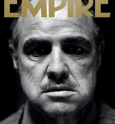
Empire Magazine (June 2004)

|
Main Coverline
The main coverline is located at the bottom of the magazine cover. Unlike traditional magazine covers, the coverline is not outstanding and eye catching. The purpose of this is to draw attention to the main image. Additionally, the simplicity could suggest that the subject does not need an outlandish design to attract readers due to the high quality and reputation of the film. 
|
Masthead
The masthead is in large bold gold letters in the iconic Empire font. The colour gold has been used frequently throughout the cover as well as on the masthead. This could be to suggest that the film that is the main subject; The Godfather, is a timeless movie which is represented by the colour gold. 
|
Strapline
The strapline is at the bottom of the cover, below the main coverline. The font of the strapline is in a white italic font and is slightly larger than the main coverline. This may have been done so readers are aware that Empire is making a broad statement about the film they are featuring on their cover. 
|
Subject/Imagery
The main image covers the entire cover. It is an extreme close-up shot of Marlon Brando who was a famous actor and starred as the main character in the classic mobster movie, The Godfather. The image is also in black and white which could suggest that the film is a classic as well as the feature being a look back into the film. This is effective because it makes the cover very simplistic however, it instantly draws the readers attention due to the broad difference to other magazine layouts.
The main image covers the entire cover. It is an extreme close-up shot of Marlon Brando who was a famous actor and starred as the main character in the classic mobster movie, The Godfather. The image is also in black and white which could suggest that the film is a classic as well as the feature being a look back into the film. This is effective because it makes the cover very simplistic however, it instantly draws the readers attention due to the broad difference to other magazine layouts.
What are the conventions of: The Horror Sub-Genre
What is a Horror Sub-Genre?
Horror is a category within a wide range of other film genres. However, the horror genre has sub-genres under it which identifies the type of horror the media falls into. The different sub-genres of horror are:
Horror is a category within a wide range of other film genres. However, the horror genre has sub-genres under it which identifies the type of horror the media falls into. The different sub-genres of horror are:
- Slasher
- Splatter
- Vampire
- Psychological
- Zombie
- Monster
- J-Horror
- Thriller
|
Psycho (1960)-Slasher
The Crazies (2010)-Zombie
|
Hostel (2005)-Splatter
Jaws (1975)-Monster
|
Lost Boys (1987)-Vampire
Battle Royale (2000)-J-Horror
|
The Omen(1976)-Psychological
Carrie (2013)-Thriller
|
Horror Sub-Genre Research: Slasher
The sub-genre we chose for our horror movie concept was Slasher. Slasher is a popular sub-genre for horror movies and many iconic horror movies fall into this sub-genre. This was a main factor in our decision to choose this as our sub-genre. Below is a slideshow explaining the conventions of Slasher Films.
Here are some examples of Slasher film trailers such as The Texas Chainsaw Massacre (2003), Prom Night (1980), Child's Play (1988) and I Know What You Did Last Summer (1997).
|
|
|
|
|
Do Your Products Follow, Challenge or Develop These Rules?
In order to effectively evaluate our use of conventions in our media products, we need to review whether we followed challenged or developed these conventions. This gives us the opportunity to understand how professionals in the film industry use conventions and how their use is vital in the industry.
Horror Sub-Genre: Slasher Conventions
The Killer
For our killer, we followed all the conventions needed for a slasher. Examples of this are seen below. In comparison to the famous Slasher killer Michael Myers from Halloween, our killer Mr Sterling also has a mask that conceals his identity similar to Michael Myers. Additionally, both killers have an iconic weapon which are knives as well as psychotic tendencies. For instance, the character of Michael Myers was based on a real life mental patient, while Mr Sterling has an unhealthy and deadly infatuation with the perfect school.
For our killer, we followed all the conventions needed for a slasher. Examples of this are seen below. In comparison to the famous Slasher killer Michael Myers from Halloween, our killer Mr Sterling also has a mask that conceals his identity similar to Michael Myers. Additionally, both killers have an iconic weapon which are knives as well as psychotic tendencies. For instance, the character of Michael Myers was based on a real life mental patient, while Mr Sterling has an unhealthy and deadly infatuation with the perfect school.

|

|
The Victims
We also followed the conventions for the victims of Slasher films. Like the victims from The Cabin In The Woods, the victims in our horror film are being punished by the killer; Mr Sterling for participating in illegal vices and bad behaviour. Just like The Cabin In The Woods, our film includes a popular and pretty girl, an easily agitated jock, an unreliable stoner, and lastly a 'final girl'. However, we also developed our victim cast and added two extra characters. They included a melancholic Goth and a well-behaved male characters who is similar to the 'final girl'. We also developed our characters by linking their personalities to each of the seven deadly sins.

|

|
The Final Girl
In regards to our 'final girl', we followed the conventions of the Slasher sub-genre. The inspiration for our 'final girl' was Nancy Thompson from A Nightmare on Elm Street. Just like Nancy, our final girl; Alex, was not involved in the bad behaviour of her peers and because of this, survives till the end to defeat the killer, Mr Sterling. We also ensured that our Alex's costume represented her personality, as a result, we ensured she wore white, like Nancy to demonstrate her innocence.
|

|
Film Teaser Trailer Conventions
Followed
|
Lighting and Setting
For our trailer, we followed the convention lighting and setting. The setting of our trailer followed the plot of our film which is based in a college where we filmed inside as well as outside the college building. We also used natural lighting for indoor shots. This is also evident in the 2003 remake of The Texas Chainsaw Massacre where the film was set in a remote town. |
Costume and Props
We used a large amount of costume and props for our trailer. This was primarily based on the genre of our film which was Slasher. Consequently, our antagonist, Mr Sterling had a white mask, suit and red tie as his costume which relates to his whole character as a killer. This is similar to Ghostface who is the antagonist in Scream. Furthermore, we used the props such as a knife similar to what the killer Ghostface used in Scream. |


Developed
Editing, Camera Techniques, Pacing and Length
We developed the pacing of our trailer t
We developed the pacing of our trailer t


Film Poster

Followed
|
Pull Quotes and Review Stars
We used pull quotes and review stars to indicate to our audiences the quality and standard of our film. In comparison, the film poster for the film Scream has used one pull quote, unlike our poster which used two as well as the review stars. |
Actor/s Name
Additionally, we used large font for the actor/s names which is located at the top of the poster which is also used on the Scream poster. The effect of this is so audiences see the 'star power' cast in the film and may be attracted to watch the film due to their favourite actor or actress starring in it. |
Tagline
Lastly, we ensured to put the tagline directly below the film title to draw the audiences attention, this is also demonstrated on the 1974 Texas Chainsaw Massacre Poster. |


Developed
Film Title
The film title is the convention we developed on our poster. This is evident through the typography which has a range of effects and styling. Firstly, we used a subtle scratched effect font and used two different colours for the two different words in the title. This makes the title stand out the most against everything on the poster. This can be found in the poster for Alfred Hitchcock's Psycho.
The film title is the convention we developed on our poster. This is evident through the typography which has a range of effects and styling. Firstly, we used a subtle scratched effect font and used two different colours for the two different words in the title. This makes the title stand out the most against everything on the poster. This can be found in the poster for Alfred Hitchcock's Psycho.


Challenged
The convention we challenged in our poster was the background for our main image. It is common for plain backgrounds to be used. However, we incorporated the plot of our film as well as our tagline into our image. This makes our poster look intriguing and mysterious to our audience. Examples of how this has been used in other slasher posters are from the 2009 remake of Friday the 13th and the 2007 remake of Halloween.
The convention we challenged in our poster was the background for our main image. It is common for plain backgrounds to be used. However, we incorporated the plot of our film as well as our tagline into our image. This makes our poster look intriguing and mysterious to our audience. Examples of how this has been used in other slasher posters are from the 2009 remake of Friday the 13th and the 2007 remake of Halloween.


Film Magazine Front Cover

Followed
For our film magazine front cover, a convention we followed was the masthead being altered to match the main cover story of the the magazine. This is done by other movie genre magazines to show how large and exciting the cover story feature is. For example, on the Fangoria Magazine cover which featured the Twilight Saga as it's cover story altered it's usual masthead to match the vampire theme. Also the design attracts readers or fans who are familiar with the design or typography of the film that is featured on the cover.
For our film magazine front cover, a convention we followed was the masthead being altered to match the main cover story of the the magazine. This is done by other movie genre magazines to show how large and exciting the cover story feature is. For example, on the Fangoria Magazine cover which featured the Twilight Saga as it's cover story altered it's usual masthead to match the vampire theme. Also the design attracts readers or fans who are familiar with the design or typography of the film that is featured on the cover.


Developed
The convention we developed was our puff. Commonly, puffs only have text within. Nonetheless, we decided to include images from the feature. We thought this would be effective, as it allows the reader to see what is on offer before they flip to the page and they are able to have an idea of what to expect. For the Fangoria cover the puff contains the magazines tagline rather than featured stories.
The convention we developed was our puff. Commonly, puffs only have text within. Nonetheless, we decided to include images from the feature. We thought this would be effective, as it allows the reader to see what is on offer before they flip to the page and they are able to have an idea of what to expect. For the Fangoria cover the puff contains the magazines tagline rather than featured stories.


Challenged
We challenged the conventional use of coverlines with the same style font and typography. On our cover, we have changed the text according the story and also depending on whether or not the feature is a regular section of our magazine. This makes our cover look visually pleasing and engaging for our readers. A example of this is from a Fangoria magazine cover where an example of varying fonts.
We challenged the conventional use of coverlines with the same style font and typography. On our cover, we have changed the text according the story and also depending on whether or not the feature is a regular section of our magazine. This makes our cover look visually pleasing and engaging for our readers. A example of this is from a Fangoria magazine cover where an example of varying fonts.


Conclusion
To conclude our evaluation for question, we had to consider all the conventions that are needed for a film teaser trailer, film poster and movie magazine front cover. This allowed us to look at what we wanted to include challenge or develop on our media products and evaluate how our final products compare to those from the real media industry.